

The principles I come back to
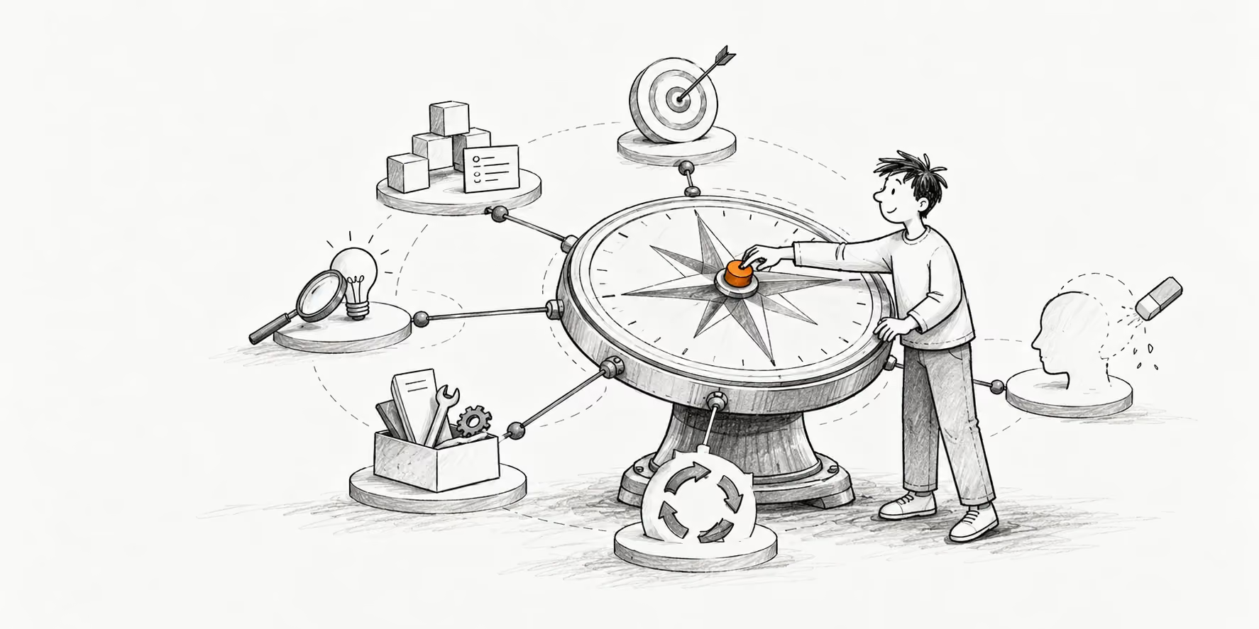
On caring about the work, questioning how it gets made, and leaving room to change my mind.
Imagine a beautifully designed screen that leaves you unsure what happens when you press the main button. The spacing is right. The typography is considered. You still hesitate.
That gap interests me. A lot of effort can go into an interface while something important remains unresolved. What am I deciding? What happens next? Can I undo it? Those questions are part of the craft, too.
I care deeply about how products feel. Design systems have been a significant part of my career, and I enjoy getting into the details. But the details need a reason. I want to understand the decision underneath the component as much as the component itself.
These are the principles I come back to when I’m trying to work through those decisions. They also describe the kind of designer I want to keep becoming. I expect my understanding of them to change as I work with more people and encounter problems I haven’t solved before.
Five questions behind the work
Business. What value should this product create, for the people using it and the business sustaining it? That gives the design a purpose to work toward.
Structure. Can someone understand what they are deciding, what happens next, and how the parts fit together? Resolve the meaning underneath the interface.
Craft. What does each detail change for the person experiencing it? Use copy, behaviour, and visual care to make the experience more considered.
Process. What do we need to learn from this version? Make the idea tangible, look for evidence, and let the next decision respond to what you find.
Curiosity. What new capability would let me explore this problem differently? Try unfamiliar tools while keeping responsibility for the quality of the result.
Business comes first
Take a subscription cancellation flow. A business might want fewer cancellations. The person using the product wants to stop paying. Making the exit harder could serve the immediate number while making the relationship worse.
When I say business comes first, I mean I want to understand what the business is trying to achieve and why. I also want to question whether the proposed design actually serves that goal. Keeping someone subscribed because they couldn’t find the exit is a very particular kind of “success.” I wouldn’t want to leave that definition unchallenged.
Good user experience belongs inside the business conversation. People need a reason to choose a product, trust it, and keep using it. The design has to make sense within the constraints of delivering that value, including what the team can realistically build and support.
My starting question is: what are we trying to improve, and for whom? If we can’t answer that clearly, I’m reluctant to treat a new screen as the answer. We might need to examine the offer, the workflow, or the assumption that created the request.
Structure before beauty
Consider a permission setting called “Manage.” It looks simple enough in a dropdown. But does it let someone edit a project, invite other people, delete files, or change billing? A clean interface can hide a very unclear agreement.
I want to resolve that agreement before spending too much time on its appearance. The terminology, hierarchy, sequence, and behaviour need to make sense together. Otherwise, the person using the product has to supply the missing logic.
This is one reason design systems matter so much to me. A reusable component carries decisions. An expandable card needs a relationship between its compact and detailed states, a way back, and consistent behaviour across input methods. Those decisions belong to the system alongside its visual form.
I don’t see structure and visual design as separate worlds. Exploring the interface can expose gaps in the structure. But when something feels confusing, I want to look underneath the styling before adding another explanation or visual cue.
Can someone understand what they’re deciding? That question earns its place before “Does this look finished?”
Craft means going further into the idea
A finished screen can hide an unfinished experience. A button might look finished in a file. I still want to know what happens when I press it. What does it say while it works? What tells me it’s done? If I change my mind a second later, can I take it back?
This is what I mean when I say I care about craft. I want to stay with an idea long enough to find the decisions the first version hasn’t forced me to make yet. The composition matters, but so do the transitions, the intermediate states, and the small responses that make it feel like a coherent thing.
I like the point where a component stops being a picture and starts revealing its behaviour. A hover can suggest that something is available to explore. A press can acknowledge my input. A pending state can tell me it’s working. A confirmation can tell me it’s done, and an undo gives me a moment to change my mind.
Go inside the interaction.
The same share dialog, built twice. The second does more and asks less.
Share
Invalid input
- You (owner)
- priya@example.com (Can edit)
Share “Q3 roadmap”
2 people have access
- sam@example.com
People with access
- YouOwnerOwner
- Priya Nairpriya@example.comCan edit
Only people with access can open it.
Open on another device
Point a phone camera here. This one is illustrative, so it won’t scan.
Invite someone in each version. Try a typo, change the access, then undo. Try it at ¼ speed and with a keyboard too.
What to look for
- The first pass labels its field with a placeholder that disappears as you type. The considered one keeps a label and turns each address into a chip.
- A typo in the first pass pushes a generic “Invalid input” in above the form. The considered one says what to fix, under the field, in space it already kept.
- The access menu grows out of its button and explains each role in a line, where a native select only names them.
- “Sharing…” changes the first button’s width and takes keyboard focus with it. “Inviting” holds its size, and focus stays put.
- New people slide into the list with an undo and a countdown, instead of snapping in with no way back.
- Copy link confirms itself. General access and the QR code are one step away, not missing.
Try it with reduced motion on as well. The information and controls still need to work.
The first pass sends the invite. Going deeper means asking what the button says while it waits, whether anything moves that shouldn’t, and how I get back if I sent it to the wrong person. Then there are less obvious situations: pressing twice, using a keyboard, or choosing less motion. Each of those situations is part of the same design.
Microinteractions give me something precise to refine. Perhaps a panel arrives from the wrong place. Perhaps the acknowledgement takes too long, or an icon swap makes the label jump. I want to notice those things, understand what feels disconnected, and work on the particular decision causing it.
I’m also interested in beauty, personality, and the pleasure of exploring something carefully made. A product can invite a little curiosity. That doesn’t mean every control needs to perform. Repeated actions need restraint; an occasional moment can have more character. The depth is in making that distinction.
First, notice what is actually happening
“It feels off” is a useful beginning. I want to get more specific from there. Does the movement start before my eye has found its source? Do two related elements settle at different times? Is the composition balanced at rest but awkward while it changes?
Josh Puckett’s Noticing gives language to this practice of moving beyond an immediate impression. I connect it to the way I watch a film: I’m interested in the narrative, but I also want to understand why a particular moment stays with me. Looking longer gives me more to question.
For my work, the useful habit is to name the observation before prescribing the fix. If I can say “I couldn’t tell whether it sent,” I have a much better starting point than “add a nicer animation.”
Decide what better means here
A playful collection and a payment approval screen shouldn’t aim for the same feeling. Before refining either one, I want a view on what the experience should communicate. The collection might invite exploration. The approval screen might need to feel composed and deliberate.
The Facets of Quality approach is useful here: choose the qualities that matter to this particular experience, then use them to make critique more specific. I wouldn’t treat a subjective score as user evidence. Its value is in exposing what we’re aiming for and where our judgments differ.
For the invite above, I’m aiming for something responsive, reassuring, and composed. Those words give me practical questions. Does the button answer the moment I press it? Can I tell it’s working, and that it’s done? Is the motion calm enough that I read the words rather than the movement? More movement would not necessarily improve any of those things.
This is also where I connect with Uncommon Care. I want to take the parts I could easily leave unresolved and give them another look. Sometimes that means a more beautiful transition. Sometimes it means rebuilding a behaviour because the polished version still doesn’t hold together.
Design is a process
The invite above begins with a choice: send immediately and offer undo. Before refining that choice, I want to know whether it is worth pursuing. A confirmation dialog, or a draft that sends later, would each create a different experience. Changing the button’s colour would leave the underlying idea intact.
The distinction in Conceptual Range matters to me here. Exploring alternatives means changing how a problem is approached. Once I have a direction worth developing, I can spend more attention on its depth.
I think of a first version as a way to make an idea concrete enough to question. A prototype gives a conversation something to lean on. Putting it in front of people can reveal where my explanation and their understanding part ways.
I also want to separate the question I’m exploring from the fidelity of the whole product. As Separation of Concerns describes, the useful prototype is the one that lets you judge the concern at hand. If I’m testing whether people notice the undo in time, a plain box may be enough. If I’m judging the feel of a finished interaction, I need the typography, content, and timing to work together.
The useful part of iteration is identifying what changed my mind. If I move a button, I want a reason beyond being tired of where it was. If a design survives a review, I want to know which questions we actually tested rather than assume silence means it works.
A version should help answer a question
- Make an assumptionPeople will trust sending without a confirmation step.
- Make it tangibleBuild the send, pending, and undo states.
- Look for evidenceDo they notice the undo in time?
- Revise the decisionAdjust the undo window, wording, or placement.
Bring what you learned into the next version.
This continues after release. The behaviour we imagined and the behaviour that happens are not guaranteed to match. I want enough room in the process to notice that difference and respond to it.
There are deadlines, of course. I’m interested in making a sensible decision with the evidence available, while being honest about what remains uncertain. A deadline can close a release. It doesn’t have to close the question.
Stay curious about how products get made
I dislike staying inside my comfort zone for too long. I enjoy exploring new tools and unfamiliar ways of making things because they expand the range of ideas I can actually try.
For example, being able to build an interactive version lets me examine things a static screen leaves open: timing, keyboard behaviour, what happens during loading, and what the interface does when something fails. The tool is useful because it makes those questions easier to investigate.
That is how I want to approach AI as well. I’m interested in the capability it adds to my practice. Can I explore a behaviour sooner? Make a small tool for a problem I keep encountering? Test an idea that would otherwise stay in a file?
I still have to judge the result. Something running is not the same as it being understandable, appropriate, or well made. New tools give me more to work with, including more things I need to inspect.
My curiosity extends beyond design software. I read every day, and I’m a TV series and movie nerd who likes getting into the narrative. Malayalam cinema is a particular favourite for its storytelling. I don’t need every interest to become a design lesson. I like spending time with things that make me pay attention.
Leave room to unlearn
There is a tension in having principles. They help me make decisions, but they can also become a way to defend a familiar answer. “This is how I work” can shut down a conversation just when it gets interesting.
When I collaborate, I want to bring a point of view and remain willing to revise it. Someone else might understand a constraint I’ve missed. A junior designer might ask a question I’ve stopped asking. Experience gives me a starting point; I don’t want it to make me difficult to teach.
Community building and mentorship matter to me partly because I enjoy that exchange. There is value in making space for someone else’s questions without needing to have a polished answer immediately.
I want to be able to explain a decision, and hear the reason it might need to change.
Unlearning doesn’t mean abandoning every principle whenever someone disagrees. It means looking closely at how I’m applying it. “Structure before beauty” should help me make something understandable. If I’m using it to postpone exploring an interface that would clarify the problem, I’ve made the phrase more important than its purpose.
What I do with these principles
I don’t need to recite all of this in every design review. I need it to change the questions I ask when something feels unresolved.
- What value are we trying to create, and whose experience are we overlooking?
- Can someone understand the decision without my explanation?
- Which detail would make the next step clearer?
- What have we learned from this version?
- What could I try that my usual approach doesn’t allow?
- What would make me change my mind?
The last question matters when I feel particularly attached to a solution. If I can name the evidence that would change it, I have somewhere useful to take the next conversation.
Have a different way of thinking about one of these?